Wednesday 9 April 2014

Evaluation Q5 - Who would be the audience for your media product?

My ideal reader would be for example 18, Female (70% Female 30% Male), since they are 18 they would probably still be in education so would most often be Group E (Unskilled, Student) although a smaller percentage of my readers may be up to Group B (Managerial, middle class) depending on what type of music they enjoy. My ideal readers would probably stand out from the crowd and be a bit different as Electronic and Dance music is a niche genre of music. They would like to party rather than being quiet or having a relaxing weekend although they would be too young to own their own house or car. They would defiantly own a Smartphone, more likely IPhone than any other phone, so therefore they would use either ITunes or Spotify to access their music.

Interview:

Wednesday 5 March 2014

Double Page Spread guidelines

These are the guidelines regarding the layout of my double page spread. The position of my text and image/s will follow these guidelines.

Sunday 23 February 2014

Double page spread layout ideas


 these are my layout drafts and
ideas for my double page spread,

 some have the main image taking
 up the whole two pages, other

                                                                                                               have the image taking up one                                                                                                                       page and the others, the picture                                                                                                                     takes up half or just over half of                                                                                                                   the top of each page

Friday 21 February 2014

Double Page spread research

CODES AND CONVENTIONS


- A large image - with direct address (usually on the left)
- Quotes/Pull quotes (sometimes used as a headline, sometimes used to separate text)
- Some make use of bold and italic to make different text stand out
- Stand first - this is an introduction to the artist or the information that is being presented
- Tet - size 11pt (usually Arial)
- Drop cap - tells the reader where to begin reading from
- Columns - usually 2/3 columns of text
-  By lines - gives credit to the photographer and  writer
- The article is usually written informally to relax the reader
- Colour scheme - the double page spread uses the same colour scheme as the rest of the magazine

Analysis of an existing magazines double page spread


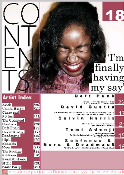
The headlining text has a grungy look to it, and is very distorted and untidy, this fits in with the genre of this magazine and most likely the artist  (Lily Allen) or her music. This double page spread goes against usual conventions in ways such as the image is on the right, and most of the article is not taken up by the main text but a large majority of space is taken up by he headline. They have used a monochrome colour scheme, which uses th colour red well, they have used the colour red to highlight significant parts of the double page spread such as artist name, this monochrome colour scheme also means that the double page spread is aesthetically pleasing, nothing clashes.  They have used the letter 'I' as their drop cap, pulling in the reader.  The artist used is very well known, although the clothes worn are quite minimalist, suggesting she doesn't care about what people think about her, again fitting in with the grunge look.

Page furniture


Pull quote


Monday 27 January 2014

Editing my images

To edit my photos I used PIXLR
First I auto adjusted my images

I then airbrushed my images to give them a smoother look

Then i chose an effect to put on the photo, with this one i chose an effect called 'Bob'

On other photos i used effects like 'Aladin', 'Peter' and 'Sanna'