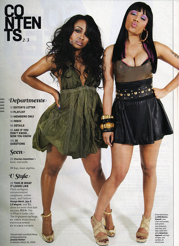
Media concepts and techniques
Masthead
The name/ logo of a magazine which is bold to introduce and attract a reader to the magazine.
This is usually the largest text aswel.
Headlines
large titles which are the main articles in the magazine.
This is the next biggest font from the masthead.
Cover lines
Text which indicates the content of the magazine,
which is smaller than a headline and usually cone underneath the headline.
Pull quotes/Lure
quotes that have been taken from the magazine's articles and specifically
pulled out to draw the reader in and make them want to read that specific article.
Features/ articles
the news and information which is actually included in the magazine,
advertised on the front cover to pull in the reader.
Pug/ starburst
a shape to draw in the reader with text to attract the audience to the magazine
and highlight a specific/iportant part of the magazine
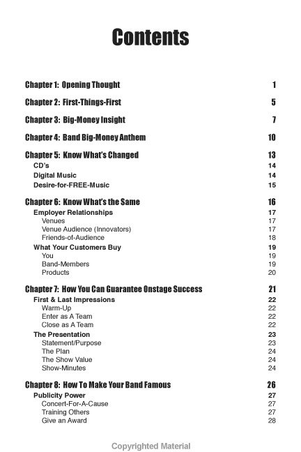
Layout
the structure of the magazine, how it is layed out.
House Style
the theme, colours and text that would make the magazine recognizable
Visual Syntax
the way in which the readers eye is drawn throughout, the route the eye is
taken down the front cover.
Straplines
headlines are a smaller font appearing below a major headline.
Hook
method of luring through the design.
Banner
a coloured banner with text on it usually located at the bottom of the page
Photos
the images used and how they are placed.
Masking
cutting around a photo to superimpose it on to a background.
Gutter
space between columns.
Stand first
introductory paragraph before the main article.
Stroke
line put around text or an article to make it stand out.
Use of colour
how colour is used on the page.
Drop-shadow
shadowing around a text to make it stand out and to draw the readers eye
Cropping
cutting off parts of an image to emphasise a particular aspect of the image.


.jpg)


.jpg)
.jpg)
.jpg)
.jpg)
.jpg)
.jpg)
.jpg)
.jpg)
.jpg)
.jpg)
.jpg)
.jpg)

.jpg)
.jpg)
.jpg)
.jpg)
.jpg)
.jpg)
.jpg)

.jpg)

.jpg)
.jpg)
.jpg)